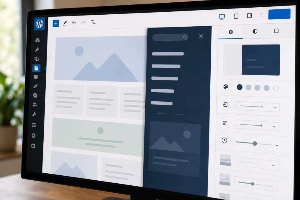
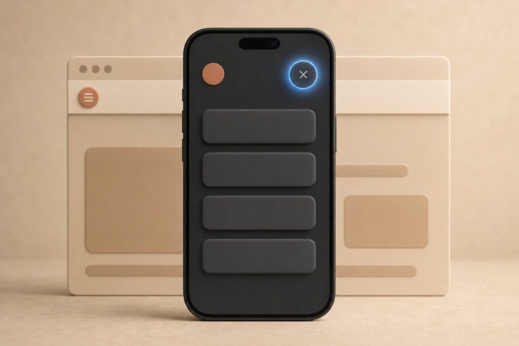
The navigation overlay is the panel that covers the screen when someone taps the hamburger icon on a phone. For years that panel was a locked default: WordPress decided its layout, its spacing, and its close button, and you lived with the result. In WordPress 7.0 the navigation overlay becomes something you design block by block in the Site Editor. This guide covers what the overlay is, when it triggers, how to open and edit its canvas, how to style it, and how to keep it usable for keyboard and screen-reader visitors.
What the overlay actually is now
Before 7.0, the Navigation block rendered a fixed overlay on small screens. The design, layout, and content were fixed, and the only real lever was a handful of color and typography settings inherited from the block itself. If you wanted a logo at the top of the menu, a search field, or a call to action, you reached for a plugin or custom code.
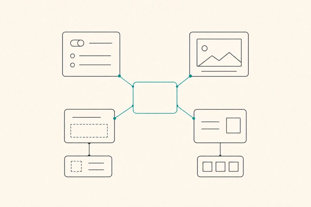
WordPress 7.0 removes that restriction. A navigation overlay is now a full block canvas. It can hold anything blocks can express: a Navigation block for your links, a Site Logo, a Search block, Social Icons, a heading, a button, or any combination of those. Under the hood, each overlay is stored as a template part in a new navigation-overlay template part area. That detail matters for two reasons. First, because overlays are template parts, you can find and edit them through the Patterns section of the Site Editor sidebar as well as through the Navigation block. Second, because they only render correctly when a Navigation block calls them, WordPress deliberately keeps overlay template parts out of the general block inserter so nobody drops one into a page by accident.
The feature is opt-in. By default, the Navigation block keeps using the standard overlay from earlier versions, so nothing changes on your site until you create or assign a custom overlay. Each overlay is tied to a Navigation block. One overlay per block is the common setup, though the same overlay can be referenced by more than one block if you want a shared menu design.
If the block model itself is new to you, our Gutenberg block editor walkthrough is a good warm-up before you start editing template parts.
When the overlay triggers
The overlay is a responsive behavior, so the first thing to settle is when it appears. Select the Navigation block and open its settings in the inspector. The Overlay Menu control gives you three choices:
- Mobile is the default. The horizontal menu shows on wider screens and collapses into the hamburger and overlay on smaller ones.
- Always forces the hamburger and overlay at every screen width, which suits minimal headers or link-heavy sites.
- Never keeps the menu inline at all widths and never opens an overlay, which only makes sense for very short menus.
The breakpoint that separates "wide" from "small" in Mobile mode is roughly 782px, and it is hardcoded in the Navigation block. WordPress 7.0 does not expose a field to change that number in the editor, so if your header needs the overlay to kick in earlier or later, you still handle the breakpoint with a small custom CSS rule or a helper plugin. Plan the trigger before you plan the design, because a menu that collapses at the wrong width looks broken no matter how well the panel is styled.
Opening and editing the overlay canvas
Creating an overlay takes a few clicks and no code. The path runs through the Site Editor:
- From the dashboard, go to Appearance, then Editor to open the Site Editor.
- Open Patterns, then Header and select the header that holds your menu.
- Click the Navigation block, then open the Block tab and its Settings in the right panel.
- Find the Overlay section and choose Create Overlay, or pick an existing overlay if your theme ships one.
- WordPress drops you into the navigation overlay editor, a dedicated canvas where you add, arrange, and style blocks.
Inside the canvas, treat the overlay like any other template part. Add a Site Logo at the top, keep the Navigation block for the links, drop in a Search block if visitors expect it, and add a Navigation Overlay Close block wherever the close control should sit. That Close block is new in 7.0 and worth adding by hand. If you leave it out, WordPress inserts a fallback close button on the front end for safety, but that automatic button may not match your design or land where you expect. Placing it yourself gives you control over its position and appearance.
Because the overlay is a template part, your changes save with the rest of your templates and apply everywhere that Navigation block appears. If you want different menus in different regions of the site, create separate overlays and assign each to its own Navigation block.
Styling the navigation overlay
Styling happens with the same controls you already use elsewhere in the block editor, which is the point of moving the overlay into blocks. Set the panel background and text colors on the overlay’s outer group so the menu reads cleanly against whatever sits behind it. Adjust typography on the Navigation block for link size and weight, and use spacing controls to give the links room to breathe under a thumb. A cramped list of links is the most common mobile menu mistake, and generous padding fixes most of it.
Submenus deserve attention. On the Navigation block you decide whether submenus open on click or on hover and whether they show an arrow indicator. On a touch overlay, click behavior is almost always the right call, since hover does not exist on a phone. If your menu runs deep, consider whether every level belongs in the overlay at all, or whether a flatter structure serves visitors better.
One habit worth keeping: preview the overlay at real device widths, not just in the editor. The overlay panel and the responsive collapse interact with the rest of your header, and what looks balanced on a laptop can crowd on a 360px screen. If you are already using the per-breakpoint controls from our guide to responsive block visibility in WordPress 7.0, the same discipline of checking each breakpoint applies here.
Accessibility: focus, ARIA, and keyboard
A menu that opens over the whole screen is a modal surface, and modal surfaces have rules. The good news is that the Navigation block handles most of them for you. When the overlay opens, it is exposed to assistive technology with role="dialog" and aria-modal="true", which tells a screen reader that interaction is now confined to that panel. Focus moves to the close control as soon as the overlay appears, focus is trapped inside the panel while it is open, the Escape key closes it, and arrow keys move through the links. The menu is keyboard accessible on the front end by default.
Your job is to avoid breaking those defaults. Keep a visible, clearly labeled close control, which is exactly what the Navigation Overlay Close block gives you. Check color contrast on the overlay background and link text, since an overlay is often a different color scheme than the page and easy to get wrong. If you add custom blocks or interactive elements inside the overlay, make sure they are reachable and operable by keyboard too, because the focus trap only helps if everything inside it can actually take focus. Test with the keyboard alone and, if you can, with a screen reader, before you ship.
Limits to know in the first release
The 7.0 version of navigation overlays is powerful but young, and a few limitations are worth planning around. Overlays render full-screen only in this release. A partial sidebar or drawer style is not supported yet, since that requires a true dialog element with click-outside-to-close behavior that is planned for later. Overlay template parts are also tied to the active theme, so a custom overlay does not carry over if you switch themes. And the feature is intentionally scoped to navigation: it is not a general-purpose popup or modal system, and a separate Dialog block is in development for those wider cases.
None of that blocks a solid mobile menu today. It just means you should treat the overlay as a navigation surface, keep the design full-screen, and rebuild it if you change themes. For the broader set of changes that landed alongside this feature, our roundup of what’s new in WordPress 7.0 puts the navigation overlay in context with the rest of the release.
Frequently Asked Questions
What is the navigation overlay in WordPress 7.0?
It is the full-screen menu panel the Navigation block opens on smaller screens when a visitor taps the hamburger icon. In WordPress 7.0 that panel is a full block canvas stored as a template part, so you build and style it from blocks in the Site Editor instead of accepting a locked default.
Do I have to use the new overlay, or is it optional?
It is opt-in. By default the Navigation block keeps using the standard overlay from earlier versions. Nothing changes until you create a custom overlay or assign an existing one to a Navigation block through the block’s settings in the Site Editor.
How do I open the overlay editing canvas?
Go to Appearance, then Editor to open the Site Editor. Open Patterns, then Header, and select the Navigation block. In the Block tab under Settings, find the Overlay section and choose Create Overlay. WordPress opens a dedicated canvas where you add and style blocks.
Can I change the breakpoint where the overlay appears?
The Overlay Menu setting lets you choose Mobile, Always, or Never, which controls whether the overlay is used at all. The pixel width for Mobile mode is roughly 782px and is hardcoded in the Navigation block. To move that breakpoint you still need a small custom CSS rule or a helper plugin, because the editor does not expose the number.
What blocks can I put inside a navigation overlay?
Any block. Common choices are a Navigation block for the links, a Site Logo, a Search block, Social Icons, headings, and buttons. You should also add the new Navigation Overlay Close block so the close control matches your design rather than relying on the automatic fallback.
Is the navigation overlay accessible by default?
Yes. The overlay is exposed with role=”dialog” and aria-modal=”true”, focus moves to the close control when it opens, focus is trapped while it is open, Escape closes it, and arrow keys move through the links. Keep a visible close button and check color contrast so you do not undo those defaults.
Does my custom overlay survive a theme switch?
No. Overlay template parts are tied to the active theme in this release, so a custom overlay is not preserved if you change themes. Plan to rebuild the overlay after a theme change, and keep a record of its block structure so the rebuild is quick.
Can I use the overlay as a general popup or modal?
No. Navigation overlays are scoped to the Navigation block and render full-screen only in this release. A partial drawer style and a general-purpose Dialog block are planned for later versions, so use the overlay strictly as a navigation surface for now.