WordPress 7.0 redesigned the Navigation block’s mobile menu behavior into a more general "navigation overlay" surface that handles both mobile and desktop overlay patterns through a single configurable interface. The change is small in the codebase and substantial in what site editors can do without writing custom CSS. The overlay can slide in from any side, can have its own design separate from the parent Navigation block, can differ between mobile and desktop, and can be previewed and styled directly in the block editor through a dedicated overlay canvas. The capability gap to commercial page-builder navigation tools has narrowed substantially.
This piece is the operational guide for site editors who want to use the new overlay capability. We walk through what the overlay actually is, how to configure it for the common patterns (mobile hamburger menu, desktop mega-menu, attention-grabbing announcement overlay), the design controls available, how the overlay interacts with the broader navigation block and the rest of the WordPress 7.0 block model, the accessibility considerations that overlay designs need to handle, and the cases where custom CSS is still necessary. The piece assumes context on WordPress 7.0 itself; our earlier pieces on the WordPress 7.0 release and the pattern-as-component model cover the broader release.
The short version is that the navigation overlay is now a first-class design surface in WordPress 7.0 rather than a hidden mobile-only behavior. For site editors who want polished navigation experiences without leaving the block editor or installing third-party block libraries, the new overlay is the right default. For sites with unusual navigation requirements (full-page mega-menus with rich content, gesture-driven mobile menus, navigation that animates differently than the standard options), custom code is still needed, but the threshold where custom code becomes necessary has moved meaningfully higher.
What the navigation overlay is
The Navigation block in WordPress has historically had two distinct presentations: a horizontal navigation bar on desktop and a hamburger menu that opens to a mobile-specific menu on mobile. The mobile menu’s behavior was hardcoded with limited customization; site editors who wanted a different mobile navigation pattern typically reached for custom CSS or a third-party Navigation block from one of the major block libraries.
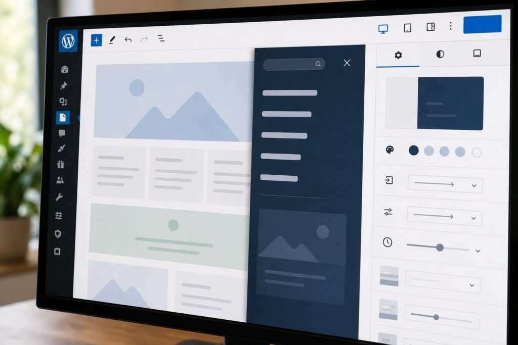
WordPress 7.0’s navigation overlay generalizes this. The overlay is its own design surface inside the Navigation block, with its own block settings, its own design controls, and its own preview canvas. The overlay can be configured to open from a trigger (the hamburger icon being the default, but configurable to other triggers including custom icons and custom positions), to slide in from any of the four sides of the viewport (left, right, top, bottom), and to display the navigation menu plus any additional content the editor chooses to include.
The overlay’s contents are not limited to navigation links. The block editor lets site editors place any blocks inside the overlay: heading blocks for category labels, image blocks for featured content, search blocks for site-wide search, social media link blocks, even forms or call-to-action buttons. The overlay is a general design canvas that happens to typically include navigation.
The overlay can differ between mobile and desktop through the responsive block visibility controls that WordPress 7.0 also introduced (covered in our separate piece on that feature). A mobile-specific overlay can have a different layout from the desktop overlay, with the visibility controls hiding the inappropriate version at each viewport.
The overlay canvas in the editor
The substantial editor-side improvement is that the overlay state is now previewable directly in the block editor. Without leaving the editor, the site editor can:
Click the overlay trigger to open the overlay in the editor canvas. The overlay slides in the same way it will on the published site. The editor canvas shows the overlay state with the underlying page partially obscured behind it.
Edit the overlay’s blocks directly while the overlay is in its open state. Block selection, block insertion, and block configuration all work the same way they would for any other blocks. The editor treats the overlay as a normal editing surface.
Toggle between the closed-overlay and open-overlay states with a single button. The editor remembers which state is being viewed and preserves the user’s position when switching.
Preview the overlay at different viewports through the same viewport simulator that the responsive visibility features use. A mobile-targeted overlay can be previewed at the mobile viewport without going to the published site.
This editor canvas is the single biggest practical improvement. Designing the overlay no longer requires publishing the site, checking the rendered output, going back to the editor, making changes, republishing, checking again. The iteration loop is now contained inside the editor.
Configuring the overlay: the common patterns
Three common navigation patterns and how to configure each in WordPress 7.0:
Mobile hamburger menu (the standard pattern). Select the Navigation block. In the block inspector, the Overlay section appears below the standard Navigation settings. Configure the overlay to be triggered by the hamburger icon (default), to slide in from the right (default for left-to-right languages), and to display the navigation menu items. Use the responsive block visibility controls to hide the desktop horizontal navigation on mobile and show the overlay trigger. The result is the standard hamburger-menu pattern with site-editor-controlled animation and styling.
Desktop mega-menu overlay. For sites that want a richer desktop navigation than a simple horizontal bar, configure the overlay to open from the top of the viewport (slide-down from the top edge), to display navigation items grouped into columns, and to include additional content (featured products, recent posts, calls to action) alongside the navigation. Use responsive visibility to show this overlay on desktop and tablet but hide it on mobile (where the simpler hamburger menu is more appropriate). The result is a mega-menu pattern without needing a separate plugin or custom code.
Attention-grabbing announcement overlay. Some sites use a navigation-adjacent overlay for non-navigation content: announcements, signup prompts, location selectors. Configure the overlay to be triggered by a custom button (not the hamburger), to slide in from the bottom or top, and to display whatever content the editor wants (text, form, image). This pattern uses the overlay capability for purposes beyond navigation but produces a cohesive site-wide overlay aesthetic.
Design controls
The overlay has its own design controls separate from the parent Navigation block:
Background. Background color, opacity, gradient, or background image. The overlay’s background is what fills the area the overlay occupies when open; it can be opaque or partially transparent to show the underlying page.
Typography. Font family, size, weight, line height for the navigation items inside the overlay. These can differ from the parent Navigation block’s typography, which is useful when the desktop horizontal navigation and the mobile overlay use different font treatments.
Spacing. Padding inside the overlay, margin between menu items, gap between blocks if multiple blocks are inside the overlay.
Animation. Slide-in animation timing, slide direction (which side of the viewport the overlay enters from), opening curve (ease-in, ease-out, linear). The animation defaults are reasonable; the controls let editors fine-tune.
Position and size. The overlay can be full-viewport, half-viewport, third-viewport, or custom-sized. The size determines how much of the underlying page remains visible behind the overlay.
Trigger styling. The button or icon that opens the overlay has its own styling controls separate from the overlay itself. Editors can customize the trigger’s appearance without affecting the overlay’s design.
All of these controls produce CSS that WordPress core renders into the published site. There is no custom CSS the editor needs to write for the standard cases.
Accessibility considerations
Navigation overlays have specific accessibility requirements that the editor needs to handle:
Keyboard navigation. The overlay must be openable, closable, and navigable with the keyboard alone. WordPress 7.0’s overlay handles this automatically: the trigger is keyboard-focusable, the Enter or Space key opens the overlay, Tab moves through the overlay’s interactive elements, and Escape closes the overlay. The editor does not need to do anything specific for this to work.
Focus management. When the overlay opens, keyboard focus should move into the overlay. When the overlay closes, focus should return to the trigger that opened it. WordPress 7.0 handles this automatically.
Screen reader announcements. Screen readers should announce that an overlay has opened and what its contents are. WordPress 7.0 adds the appropriate ARIA roles and labels automatically. The editor can customize the ARIA label for the overlay through the block settings; the default is "Site navigation overlay" or similar context-appropriate text.
Reduced motion preferences. Users who have set their operating system to "reduce motion" should see overlay animations skipped or simplified. WordPress 7.0 respects this preference automatically; the animations are skipped for users who have requested reduced motion.
Color contrast. The text on the overlay’s background must meet WCAG color contrast minimums. WordPress 7.0 does not enforce this; it is the editor’s responsibility to choose color combinations that meet the standards. The editor’s design controls don’t warn about contrast violations; checking the design with a color-contrast tool before publishing is the right pattern.
Touch target sizes. Navigation items on mobile must be large enough to tap reliably. The minimum recommended touch target size is 44 by 44 pixels per Apple’s accessibility guidelines and 48 by 48 device-independent pixels per Google’s. WordPress 7.0 defaults to comfortable touch target sizes; editors who customize the spacing should verify the result remains accessible.
When custom CSS is still needed
The overlay capability covers most standard patterns. Several specific cases still need custom CSS:
Non-standard animations. The overlay animations are good but not unlimited. For animations with multiple stages (the overlay slides in, then a sub-element fades in, then a third element animates), custom CSS keyframes are necessary.
Layered overlays. Multiple simultaneous overlays (a navigation overlay plus an announcement banner plus a chat widget) require custom z-index management that the standard overlay does not handle.
Gesture-driven mobile menus. Swipe-to-close, edge-swipe-to-open, and other gesture interactions require JavaScript that the standard overlay does not include.
Conditional content within the overlay. Showing different overlay content based on user state (logged in vs not, in particular country, on particular device) requires either custom code or a plugin that handles conditional content.
Custom positioning relative to specific elements. Standard overlays anchor to the viewport. Overlays that need to anchor to a specific element on the page (a dropdown that appears below a specific button) require either custom CSS positioning or a plugin that handles dropdown-style positioning.
For these cases, custom CSS or JavaScript remains necessary. The number of cases requiring custom code is meaningfully smaller than it was before WordPress 7.0, but the cases that remain are real.
Interaction with the broader WordPress 7.0 features
The overlay integrates with several other WordPress 7.0 features:
Patterns as single blocks. An overlay configured for a Navigation block can be saved as part of a synchronized pattern. The pattern preserves the overlay configuration and applies it consistently across instances.
Responsive block visibility. The overlay supports the same per-breakpoint visibility controls as other blocks, which is how the mobile-overlay-versus-desktop-overlay pattern works in practice.
Visual Revisions Timeline. Changes to overlay configurations are versioned through the new revisions timeline, so editors can roll back unwanted changes to overlay design.
AI Foundations Connectors. Plugins that integrate AI assistance (via the WordPress 7.0 Connectors API) can suggest overlay configurations based on the site’s content. This is an emerging pattern as plugins ship to take advantage of the Connectors API.
Performance considerations
The overlay capability has some performance implications worth knowing about:
JavaScript bundle size. The overlay’s JavaScript is part of WordPress core’s standard navigation script bundle. Sites using the Navigation block already load this JavaScript; sites that don’t use the Navigation block aren’t affected.
Image and content loading. If the overlay contains images or other heavy content, that content loads as part of the page load even though it’s not visible until the overlay opens. For overlays with substantial content, consider whether lazy-loading the overlay’s contents (separate from the standard page lazy-load) is worth the engineering work.
Layout shift. The overlay’s slide-in animation can cause cumulative layout shift if the overlay’s content has dynamic dimensions. The standard overlay handles this; custom content inside the overlay can introduce CLS issues that need testing.
First contentful paint. The overlay does not affect first contentful paint because it’s not visible at initial render. The relevant performance metric is the overlay’s open-animation smoothness, which depends primarily on the device’s GPU capability for compositing the animation.
Frequently asked questions
Does the navigation overlay work with all themes? Yes, with WordPress 7.0-compatible themes. Themes that override the Navigation block’s behavior may have specific limitations; check the theme’s documentation if you encounter issues.
Can I have multiple navigation overlays on the same page? Yes, but you need to manage them carefully. Multiple Navigation blocks each with their own overlay can coexist, but the editor needs to coordinate the triggers and the z-indexes so they don’t conflict.
Does the overlay work in the WordPress mobile app for editors? The overlay is editable in the mobile editor, with the same controls as the web editor. The preview behavior in the mobile editor is the same as in the web editor.
Can I trigger the overlay from JavaScript outside the Navigation block? Yes, by dispatching a custom event that the overlay listens for. The specific event names and patterns are documented in the WordPress developer documentation.
How does the overlay interact with cookies or analytics? The overlay itself doesn’t set cookies or report analytics. If you want to track overlay opens (for site analytics), you can add tracking code that listens for the overlay-open event and reports the event to your analytics platform.
Will the overlay break if a user has JavaScript disabled? The overlay requires JavaScript to function. Users with JavaScript disabled will not see the overlay; the Navigation block falls back to a basic non-overlay navigation that doesn’t require JavaScript. The fallback is functional but doesn’t provide the overlay experience.
Can I use animations beyond the built-in options? The built-in options cover slide directions and timing. For more complex animations, custom CSS is the path. The standard animations should cover most needs.
Does the overlay support nested submenus? Yes. The Navigation block’s standard nested menu structure works inside the overlay the same way it works in the horizontal navigation. Submenus expand within the overlay rather than requiring a separate level of overlay.
How does this compare to third-party block libraries like Kadence or Stackable? The third-party libraries have had more elaborate overlay capabilities for some time, with more design controls and more animation options. WordPress 7.0’s native overlay has closed most of the gap for standard patterns. The third-party libraries remain more capable for unusual patterns, but the native solution is sufficient for the substantial majority of sites.
Is the overlay compatible with full-site editing? Yes. The overlay works correctly when the Navigation block is used in full-site-editing templates and template parts. Configuration applied at the template level flows through to all pages using that template.