WordPress 7.0 ships a small feature with outsized practical impact: per-breakpoint visibility controls on individual blocks. The capability lets a site editor configure any block to show or hide at the mobile, tablet, and desktop viewport breakpoints directly from the block inspector sidebar, without writing any custom CSS or installing a plugin. The feature is a meaningful quality-of-life improvement for the substantial fraction of WordPress sites where responsive design has previously meant maintaining custom CSS, using a third-party block library, or accepting that the same content presents the same way at every viewport.
This piece walks through what the responsive block visibility feature actually does, how to use it in practice, the common patterns where it pays off, the limitations worth understanding, the interaction with patterns and templates, and how it compares to what previously had to be done with custom CSS or with third-party plugins. The piece is intended as the operational walkthrough for site editors and developers who need to start using the feature.
The short version is that responsive visibility is the right default tool for any "show this only on phones" or "hide this on desktop" decision in WordPress 7.0. It is not a replacement for custom CSS for advanced responsive design (alternative layouts, complex breakpoint behavior, fine-grained control), but it covers the substantial majority of the common cases that previously required CSS work. For sites that have been accumulating custom CSS just to handle visibility decisions, the feature is an immediate simplification.
What the feature actually does
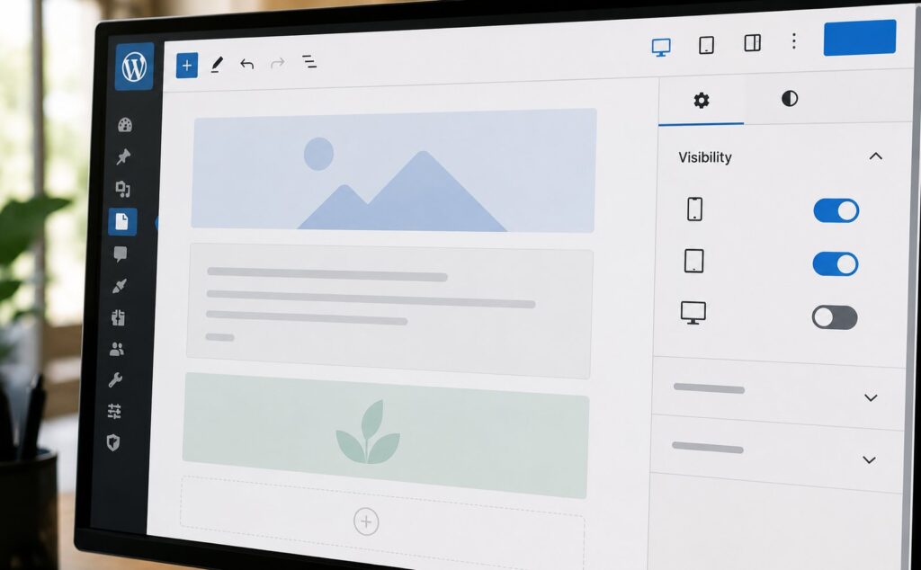
The visibility controls appear in the block inspector sidebar under a new "Visibility" panel. Each block has three independent toggles: show on mobile, show on tablet, show on desktop. The toggles operate as on/off switches; the block either shows or does not show at that breakpoint based on the toggle state.
The breakpoints follow the WordPress standard defaults: mobile is up to 600 pixels wide, tablet is 600 to 1080 pixels, and desktop is 1080 pixels and above. The breakpoints can be customized at the theme level through standard theme.json configuration, which means themes that have established different breakpoint conventions can adjust the visibility controls to match.
When a block has visibility constrained (the toggle is off for one or more breakpoints), the published HTML markup includes CSS classes that WordPress core’s responsive stylesheets target with display: none at the relevant breakpoints. The result is that the block is rendered in the HTML but hidden via CSS at the wrong viewport sizes. This is meaningfully different from server-side conditional rendering: the block content exists in the page source regardless of which viewport the user is on, and the browser handles which version to display.
The CSS-class approach has implications for SEO and accessibility worth being explicit about. Search engines crawl the page once and see all the blocks. They do not render the page at multiple viewports. So a block hidden on mobile via this feature is still indexable content; from the search engine’s perspective, the content exists. Screen readers similarly see the content regardless of viewport. This is the right default behavior for most responsive-visibility use cases but can be a footgun for cases where the editor actually wants different content at different viewports rather than the same content shown or hidden.
How to use it
The workflow in the editor:
Select a block. The Visibility panel appears in the block inspector sidebar on the right. Toggle off any of the three breakpoints to hide the block at that viewport. The editor preview updates to show the current configuration; a small indicator overlay appears on hidden blocks in the editor canvas so the editor knows the block won’t show at the simulated breakpoint.
For testing, the editor includes a viewport simulator in the top toolbar that lets you preview the page at mobile, tablet, and desktop sizes. Toggling between viewports shows what each one will actually display, accounting for the visibility settings. The simulator is the recommended way to verify visibility behavior before publishing.
For developers working at the code level, the visibility settings are stored as block attributes (the responsiveVisibility attribute with mobile, tablet, and desktop boolean values). The attribute is serialized into the block markup the same way any other block attribute is. Custom blocks can opt into the responsive visibility feature by including it in their block.json schema; the implementation is standardized at the core level.
Common patterns
Several patterns have emerged as the typical responsive-visibility use cases:
Desktop-only hero blocks. Large hero blocks with high-resolution images, video backgrounds, or complex layouts often look best on desktop and degrade poorly on mobile. The pattern is to set the desktop hero block to desktop-only, then add a mobile-specific stacked hero block that is mobile-only. The two blocks coexist in the markup; CSS handles which one displays.
Mobile-only navigation patterns. Some sites have a hamburger-menu mobile navigation alongside a horizontal desktop navigation. The pattern is to mark the hamburger version as mobile-only and the horizontal version as tablet-and-desktop. The two navigation blocks share the same site-navigation menu data but present differently.
Hiding decoration on mobile. Decorative elements (large illustrative images, animated graphics, complex visual flourishes) often add clutter to the smaller mobile viewport. Marking these as desktop-only or tablet-and-desktop preserves them where they enhance the design and hides them where they would crowd the content.
Mobile-specific calls-to-action. Some calls-to-action work better on mobile than desktop or vice versa. A "Tap to Call" button is mobile-only because tablets and desktops don’t typically make calls. A "Download Our Brochure PDF" button might be desktop-only because the PDF download workflow is harder on mobile.
Tablet-specific intermediate layouts. Tablets sometimes need their own layout that is neither the mobile stack nor the desktop sprawl. Mark the desktop and mobile versions to skip tablet, and add a tablet-specific version that’s tablet-only. This is the most architecturally complex pattern but is supported.
Conditional sidebar content. Sidebar content that makes sense on desktop but should not appear on mobile (where vertical space is scarce) can be marked desktop-only. The mobile layout drops the sidebar entirely without showing the content in a stacked-below-main-content position.
Interaction with patterns and templates
The responsive visibility settings flow through the WordPress 7.0 patterns-as-single-blocks model (covered in our piece on the new pattern model). When a pattern is inserted, its constituent blocks carry their configured visibility settings. When a synchronized pattern is updated at the source and propagated to instances, the visibility settings propagate with the rest of the update.
For template parts and full-site editing templates, the same model applies. A template with a desktop-only sidebar block continues to behave as desktop-only when the template is used. This is the right default behavior and is consistent with how other block attributes flow through patterns and templates.
A specific operational note: when a pattern instance has been detached from its source (under the pattern-as-component model in WP 7.0), subsequent changes to the source’s visibility settings do not propagate to the detached instance. The detached instance keeps the visibility settings it had at detach time. To get the new visibility behavior, re-attach the instance to the source or accept the propagation offer.
What the feature does not solve
Responsive visibility handles the show/hide case cleanly. It does not solve several adjacent problems that responsive design typically also includes:
Different content at different viewports. Visibility shows or hides existing blocks. It does not let you have entirely different content (different text, different images) at different viewports without creating multiple blocks and toggling visibility. The pattern works but produces more markup than a single block with viewport-conditional content would.
Fine-grained breakpoint control. The three-breakpoint model (mobile, tablet, desktop) covers most cases but is less flexible than the arbitrary-breakpoint custom-CSS approach. For sites that need responsive behavior at non-standard breakpoints (1240 pixels, or 480 pixels, or any other specific value), custom CSS remains necessary.
Responsive image sizing. Visibility shows or hides blocks at viewports. It does not handle the related but distinct case of serving different image sizes at different viewports. The <picture> element and srcset attributes remain the standard answer for responsive images; visibility is for whole-block decisions.
Performance optimization through code-splitting. Visibility hides blocks via CSS, which means the blocks’ content still loads. For performance optimization where the goal is to not load certain blocks on mobile (to save bandwidth), custom JavaScript is still needed. The visibility feature is for design, not for performance.
Responsive typography. Font-size adjustments at different viewports continue to use the standard CSS approaches (clamp, viewport units, media queries). Visibility doesn’t address typography.
Comparison with alternatives
Before WordPress 7.0, the common approaches to responsive visibility were:
Custom CSS. The site editor wrote CSS rules with media queries to hide specific blocks at specific viewports. The approach worked but required CSS knowledge and produced theme code that was harder to maintain than block-level attributes.
Third-party block libraries. Plugins like Genesis Blocks, Stackable, Kadence Blocks, and others offered responsive visibility as a feature. The approach worked but introduced plugin dependencies and the typical complexity of managing block libraries from multiple sources.
Responsive theme frameworks. Theme frameworks like Genesis or Astra offered theme-level responsive controls. The approach worked but tied the responsive behavior to the theme rather than to individual blocks.
The WordPress 7.0 native implementation eliminates the need for these approaches for the basic visibility case. It does not eliminate the plugins for their other features (Stackable’s design flexibility, Genesis’s broader framework capabilities), but it does remove the visibility-specific reason to install them.
Tips and edge cases
A few specific notes for working with the feature:
Test on real devices. The viewport simulator in the editor approximates mobile and tablet but does not capture all the differences (touch versus mouse interaction, OS-specific browser behavior, network speed differences). For any significant deployment, test on actual phones and tablets.
Beware the SEO implication. Content hidden via responsive visibility is still in the HTML and still indexable. If you have substantially different content for different viewports, search engines will see all of it. For most cases this is fine; for cases where one viewport version is the "real" content and the others are placeholders, consider whether server-side conditional rendering would be more appropriate.
Beware the accessibility implication. Screen readers may or may not respect the display: none behavior depending on configuration. Critical accessibility content (form labels, navigation, primary content) should not be hidden via responsive visibility; it should be present and accessible at all viewports.
Combine with aria-hidden where appropriate. For decorative elements hidden on certain viewports, consider adding aria-hidden="true" to make the decision explicit for assistive technology. WordPress core does not do this automatically for responsive-visibility-hidden blocks; the responsibility is on the editor.
Don’t overdo it. It is tempting to make every block responsive, especially when the feature is new. The simpler design approach is usually to let blocks flow naturally and only add responsive visibility for specific blocks where the responsive behavior genuinely benefits the design.
Frequently asked questions
Is this a paid WordPress feature? No. It ships in WordPress 7.0 core for free.
Does it work with any theme? Yes, assuming the theme is compatible with WordPress 7.0. Themes that override the responsive breakpoints in theme.json will use the overridden values; themes that don’t will use WordPress’s defaults.
Can I customize the breakpoints? Yes, through theme.json at the theme level. The standard mobile/tablet/desktop labels remain, but the pixel values defining each breakpoint are configurable.
Does it work with custom blocks? Yes, custom blocks can opt into responsive visibility by configuring it in their block.json. The opt-in is straightforward but does require the block to be updated; older custom blocks that haven’t been updated will not have the visibility panel.
How does it interact with the WordPress mobile app? The WordPress mobile editor (in the apps for iOS and Android) supports the visibility panel the same way the web editor does. Settings configured in either surface persist correctly.
Will it affect my Core Web Vitals scores? Indirectly. Content hidden via display: none still counts in the page’s HTML size, which affects Largest Contentful Paint indirectly. For sites where bandwidth is the bottleneck, the visibility feature does not help. For sites where the issue is layout shift or content reflow, the visibility feature can actually help by giving you control over what shows at each viewport.
Can I see which blocks have responsive visibility set in the editor? Yes. Blocks with visibility constraints show a small icon in the block toolbar indicating the constraint. Hovering shows the specific configuration.
Is there a way to bulk-edit visibility across many blocks? Not natively in WordPress 7.0. The visibility settings are per-block. Bulk editing would require either copying a configured block and pasting it into many positions, or writing a small script using WP-CLI to modify the block markup directly across many posts.
Does it work with page builders like Elementor or Beaver Builder? Page builders maintain their own block ecosystem outside of Gutenberg, so the WordPress core responsive visibility doesn’t apply to them. The page builders have their own responsive controls that operate at the page-builder level.
What happens if I export my content to another CMS? The visibility settings are stored as block attributes in the Gutenberg block markup. Exporting to another CMS that doesn’t understand Gutenberg will lose the visibility settings. The exported content will look the same at all viewports unless the destination CMS has equivalent functionality.